
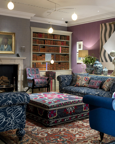
While doing up our personal spaces, we mostly think of co-ordinating colours and prints of the furnishings and wall papers. But often we come across interiors where several patterns have been mixed, making an overall colourful collage.
Experts say that bigger prints should be balanced with smaller prints. Colours need not match perfectly. Different shades of the same colour will also do the trick as long as the blending is perfect.
Also while mixing multiple prints, do add some accents like a white pillow, or plain poster, or a white wall, where the eyes can take rest and break the monotony of the print overload.
Balance florals and prints with stripes and checks. Each pattern should be repeated at least once in the room.
If the room is small, choose smaller prints in muted shades and coordinate them with small and medium polka dots. In a bigger room also, smaller prints make a soothing effect.
But some of these pictures would show you as to how you can break free of the rules and yet portray a harmonious and stylish look with all bold prints co-habiting peacefully.


So what are you waiting for? Have fun with prints, dots, stripes, checks...!!! You may send me some pictures of your rooms!
Pics courtesy: Elle Decor, House Beautiful, Country Living.
You may also see Room Splendour for ideas on mixing.
You may also see Room Splendour for ideas on mixing.
No comments:
Post a Comment