Personally I love profusion of colours in my rooms as I feel
that they bring life to any space. But I often come across neutral rooms that look
dramatic and classy. Neutrals are mostly calming and pleasing to the senses. But as with colours, one has to keep in mind several factors
while creating a neutral palette so that it doesn't look boring and lifeless.
So take tips from these on how to cleverly use the palest
grey and beige to milky whites and cream to chocolate browns and create a sophisticated space that
is warm and inviting.
Use Different Shades
of the Same Colour
If you have opted for beige, cream, taupe or any other
neutral, the same shade all over the space will make the room look very drab.
Instead, use different shades and patterns of the same colour to add drama and depth
to your room.
Multiple Textures Balance Well
Different elements and distinct textures will lift your room from mundane to interesting. So contrast fabrics with leather, wood with steel, wall colours with draperies.
 |
| A glittery entertainment unit and corner chair |
|
|
|
Create a Focal Point
Do create a focal point with a painting,
patterned rug, a tribal object etc by picking
up colours from the neutral shades in the
room to bind all the colours together.
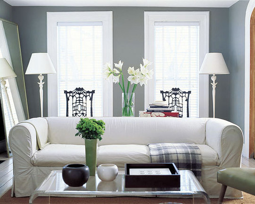
Incorporate Pattern and Colour
The large-scale pattern on the drapery or in the form of paintings will really add dimension to any neutral room. Introduce these elements in the form of an area rug, vases, cushions, trays, lamps etc.
 |
| Flowers and accents: Elle Decor |
 |
| Teal, brown, red, blue against a neutral wall : Elle Decor |
 |
| Soothing in cream, brown and turquoise: Elle Decor |
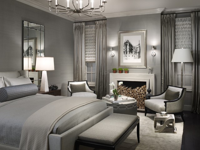
Mix Neutrals
Don't be hesitant to combine different neutral colours like beiges and chocolates, greys and whites, silver grey and deep charcoal etc.
Go White
White may look too clinical. So be careful while decorating with white. Dashes of colour in the form of accessories, furniture and fabrics will do the trick. Natural elements like flowers, dry branches, potted plants also enhance the appeal of the creamy or milky white space.
 |
| White with shades of grey |
 |
| Serene and amidst nature |
 |
| Elle Decor |
 |
| Elle Decor |
 |
| Elle Decor |
Some more soothing neutral rooms from
And finally, as I always say, add little touches of your creativity and lap up all the compliments!!


2 comments:
loved them. inspired to try them out. Neutral can be awesome
Thanks Jacinta. Do try this out and send me the pictures.
Post a Comment